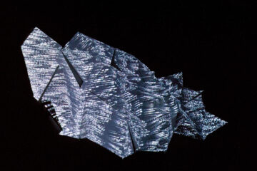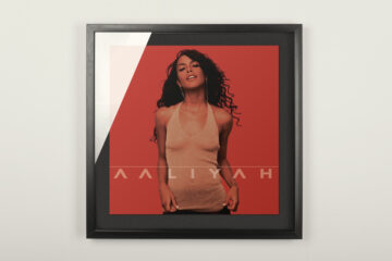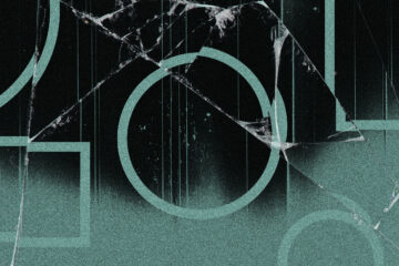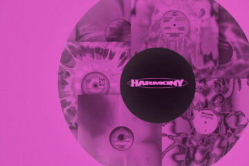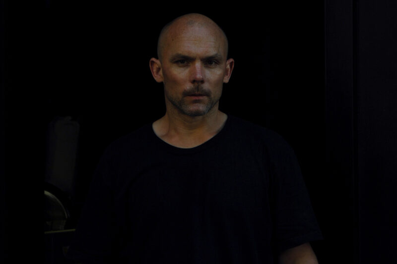
»I’ve re-branded myself once again as Positive Paul – he’s so positive it’s annoying« You can be sure of the fact that what might sound like a joke is actually a clever slice of marketing expertise because, you know, Paul Snowden, 42 year-old graphic designer, is somewhat of a brand mogul having mastered the art of creating instantly recognizable designs that can be both discreet and penetratingly in-your-face. If you walk around with eyes even slightly open you will have been infiltrated by his work: the neon sign of Kreuzberg’s restaurant Angry Chicken, Wasted German Youth T-shirts, over 200 album covers and the 2009 Berlinale slogan and several Nike campaigns. His choice of font, Futura Condensed, is simple and his messages are always cheeky and to the point.
Snowden left his native New Zealand for Hamburg in the pursuit of an exchange student he fell in love with. 10 years later, in 1999, he moved to Berlin following the internet start-up exodus to Berlin, which »never took off« but what Berlin was lacking in business opportunities it made up in raves. »I was in a club one afternoon and I made the observation that everyone was pretty off their faces – it was this wasted german youth. Six years later I started the handprinted T-shirts.« The simple design and witty slogan, wasted meaning both drunk and misused, really resonated, which Snowden explains as »having the right idea at the right time with the right aesthetic and a bit of luck.«
It has since expanded from an underground range of stickers and T-shirts into an established label with distribution spots ranging from Lyon to Seoul, an organic beer brand called Wasted German Beer, a range of charity parties spanning from Vienna to Vancouver and a Berliner Spaeti (a late night off-license) – the Spaeti being a perfect example of Snowden’s re-brand passion. »It was an experiment to re-brand something pretty non-descript while giving Wasted German Youth a brand presence.« The result is a minor aesthetic change to the Spaeti’s outer appearance; it now bears the sign »Lola’s Wasted German Beer Super Spaeti«. More importantly he transformed it into a hang-out spot making it no longer a standard shop one pops in to buy a pack of smokes from on the way to a party – it is the party.
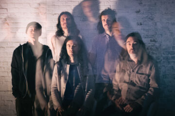
Snowden’s beer-related work didn’t stop at Wasted German Beer: this year Becks brought their Beck’s Art Label project to Germany for the first time getting Snowden and Boys Noize, among other artists, to collaborate on the design of the beer’s label, which is a pure Snowden design: he’s written »Boys Noize Techno Beer« in his signature chunky font on his signature off-tilt squares half covering a yellow, acid smiley. »I’ve been working with Boys Noize since the beginning of his career but we have just stopped working together. I think it was the seven year itch«, Snowden explains.
It seems like Snowden’s got an irritating itch with the music business itself: »Working for a record label is very ungrateful work. There is no appreciation. No one cares. No one buys records anymore so why bother. It used to be a long process where you had to take photos, develop film and go to the printers – now it’s all about doing tiny jpegs for iTunes. Fuck that.« But then there’s music labels and actual music: »Music is the highest form of art there is so you can never say no to people who make good music.« Lets see how musicians get to profit from his branding magic once his own re-brand from »Paul the graphic designer« to »Paul the ad agent« is complete.