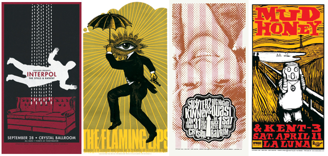
When being asked what kind of references he ties into his work, Mike King answered straight away with »Everything I ever saw, smelled, heard, tasted or touched.« The 52 year-old designer from Portland, Oregon, has been in the graphic design world for over twenty years creating CD covers, gig posters and flyers for the likes of Iggy Pop, Arcade Fire and Band of Horses. He is still very much in the game with recent clients including Unesco, La Gaite Lyrique, Pink Martini/Emi Japan, Stumptown Coffee and Ben Harper. His style, ranging from tattoo illustrations to minimal drawing to loud digital art, is as varied as his sources of inspiration, which include classic 50s and 60s design, comic artists like Will Eisner and Wally Wood, Pulp illustration artists such as Virgil Finlay and Richard Powers and Victorian art house. Here he takes us back to the 1970s where it all began and the Sex Pistols changed his life.
You got started by exchanging art work for free entry to punk gigs. What was that all about?
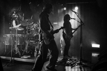
Mike King: Journey back with me to the 1970’s as I spin you the tale of how it all began … In the mid seventies I was going to high school, listening to a lot of music (much of it bad) and was trying to draw comics while wishing I was a rock star. Drawing comics and playing music were lofty goals indeed for someone like myself with marginal drawing skill and no musical ability until one evening in the spring of 1977 … I saw the Sex Pistols on TV and everything changed. Before the year was out I was playing music (terribly) and instead of drawing comics I directed my artistic energy into making flyers for my band and others. It took a few years before the music scene in Portland got past bands putting on the shows themselves to promoters or club owners doing shows. At first I did flyers in exchange for admission but eventually I was able to actually get paid to make them and so, though I never really planned to be one, I became a graphic designer. I didn’t retire as a »musician« until 1990.
From making posters to get into gigs to working with Footlocker and Modest Mouse – what were the steps in between?
Mike King: The key to making a go of all this has really been just sticking with it, keep making posters day in and day out, year after year and sometimes someone notices. The jobs for Footlocker or Hyundai are few and far between. It’s concert posters that keep me working.
Can you describe the design process behind a poster? How much freedom do you get?
Mike King: I either come up with an idea right away or I don’t. If I don’t really have an idea then I do the typo first and that buys me some time to figure out what comes next. The amount of freedom depends on the client; ideally they tell me very little and I design something that they love, they pay me promptly and I move on to the next thing. I try to avoid projects that are overly art directed, require a committee for approval, are “good exposure” or don’t pay well without a good reason.
You have a lot of different techniques and styles. What are the pros and cons? Do you still think you’ve got a signature style somewhere within all the diversity?
Mike King: I like a lot of different things and enjoy working in a variety of styles. If I stuck to one recognizable look maybe it would help but then again I might get bored and would have to kill myself.
How has the relationship between music and art changed since you started 2 decades ago?
Mike King: I used to make more album covers and it payed pretty well now I make more posters and T-Shirt designs.
Who are musicians you’d like to make art works for right now?
Mike King: Nicki Minaj, Arcade Fire, John Zorn and Fucked Up.

